
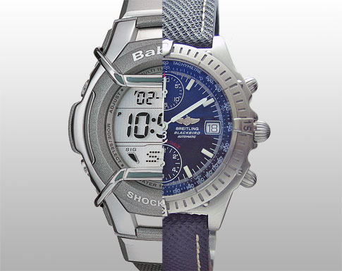
A few weeks ago, Cyan asked me what the time was. Assuming she hadn't seen the large clock on the wall above her, I told her the time, and pointed out its presence for future reference. "Oh, I know" was her reply, "It's just that it's one of those clocks with hands, and it's a pain working it out". Call me old-fashioned (pauses for predictable hilarious responses...) but I was shocked.
A quick check with her siblings revealed that all but my oldest child are happier telling the time with a digital watch than with the 'old-fashioned' version. Now one of my many obscure interests/obsessions is the science of legibility. Design and typography is all about legibility, both enhancing and obscuring it.
Human vision is a flawed and marvellous thing. Our eyes are (compared to many other animals, and especially compared to modern cameras) very average image-capture devices. It is the human brain's image-enhancing software that does the lion's share of the work in providing us with the impressive grasp of what we see around us.
Humans are analogue creatures, evolved/created to live in an analogue world. We aren't very good at the 'exact' stuff... ask someone to tell you the dimensions of two pens lying side-by-side, and the answer will be vague, but ask them which one is longer, or thicker, and the answer will usually be immediate, and accurate, even if the differences are very small. Similary, most people are good at noticing when something isn't straight and at detecting variations in colour. We're good at the 'difference' stuff.
Which is why the received wisdom on legibility favours analogue. A glance at an analogue clock should tell us the time quicker than a glance at a digital watch, because there is less processing for our brain to do. That is why, up until recently, the speedometer, rev counter and other 'instant' information feedback gauges in cars have been analogue.
However, legibility is also about familiarity. From early childhood I was taught how to tell the time on analogue timepieces. The shapes are lodged into my subconcious. Not so with my three youngest children. They are more familiar with telling the time looking at numbers, not shapes, and so they are quicker at doing it this way.
This got me thinking about a number of other areas where digital is replacing analogue. But this blog is already too long, I'll bore you another time...
Fascinating fact to throw into a lagging conversation: Have you ever noticed that analogue timepieces that employ Roman numerals, represent '4' as 'IIII' rather than 'IV'?
------------
7 comments:
There's a better case for representing 9 as VIIII rather than IX, since IX upside down is XI, where as IV upside down is only lambda I.... Do they do that as well, and then IV = IIII for consistency?
Oh you... ...I was really getting in to that, then BAM "I'm leaving it for another time!"... pfft.
*sits around, waiting patiently.*
there are so many theories on this one
optical symmetry is a possible
the favourite 'urban legend' is that because "IV" is an abbreviation for "Jupiter" they decided to use "IIII" so that their public clocks didn't have "1 2 3 GOD 5..." written on them
however, as is often the case, the most likely reason is also quite boring... IIII predates IV, with IIII being the norm in classical times... and with clocks being a very traditional item, this was simply carried on even when iv became more popular
a famous exception to the rule is the most famous tower clock in the world, Big Ben (yes, i know its the name of the clock, not the tower!), which uses the IV form on all four of its 23" diameter dials
there is also a hypothesis that the first clocks to use the IV form were clocks which had the rare feature of 'roman striking'... this used two bells, a higher pitch bell representing a one and a lower pitch bell representing a five
thus four o'clock would be struck by one stroke of the small bell followed by one stroke of the big bell; six would be struck by one stroke of the big bell followed by one stroke of the small bell, however, this system died out almost entirely in the early 18C
also, there is the simple explanation that using IIII would build a dial that has four hour-indications using a I; four indications that use a V and four indications that use an X... this has even more credence if put with the following idea...
which says that the templates purchased for the old grandfathers clocks came in sheets
a sheet of Vs
a sheet of Is etc.
using four Is for four o'clock would end up using an even number of Is and thus less waste of sheets.
1 I
2 II
3 III
4 IIII
5 V
6 VI
7 VII
8 VIII
9 IX
10 X
11 XI
12 XII
Total: 4 Vs, 4 Xs, 20 Is
there is also a lot less consistency than you might think in clock faces over the centuries, for more stuff than you want to know visit
http://members.aol.com/lolathrop/roman/iv.html
I like the 'fact for a lagging convo' I'll be noting them down and using them.
Also, I'd suggest turning on the setting that means you have to type in some letters, it stops spambots from posting.
"Big Ben (yes, i know its the name of the clock, not the tower!)"
I always thought Big Ben was the name of the Bell?
Also, I am not sure if you know but there are plans afoot to set a digital display in the middle of the clock faces just to help Cyan ;-)
yes, you're right gareth, it is the bell, thanks for that, and the 'heads up' on the future modifications :-)
Hi Brett,
Like Tim (see, I've read 'em all -- even your first post), I linked to you via Jason.
I've met neither you, Jason, nor Tim -- but I do enjoy your blog!
I especially appreciated the analogue vs digital bits. I bought myself a new watch for Christmas. I first saw the brand in a "SkyMall" magazine, but they are also available from gadgetuniverse.com. The brand name is "Steinhausen". They use roman numerals for the hands, and yet they use IV to represent the 4 (and IX for 9)...
...but have you also noticed (maybe this is urban legend, dunno) that in advertising, analogue watches are almost always shown at or near 10 minutes after 10 o'clock?
I've heard this not only allows the image to display the brand markings and date feature if available -- but also looks like a smile -- so the watch looks happy and this makes consumers want to buy them!
Cheers,
~ Keith
Post a Comment